Consistency over time
Rose charts explore repeat top scorers; retention visualizations place continuity alongside team success.
Data / Visual storytelling
Beyond the score.
Into the story.
An exploratory study of IPL history that connects player consistency, playoff pressure, rivalry patterns, and franchise brand value.
Aggregate wins and title counts show what happened, but leave out the patterns behind long-term dominance, pressure, and fan loyalty.
Match-level records, ball-by-ball data, and franchise brand values are explored through several visual forms. Each chart is chosen for a specific question rather than repeating the same ranking.
Rose charts explore repeat top scorers; retention visualizations place continuity alongside team success.
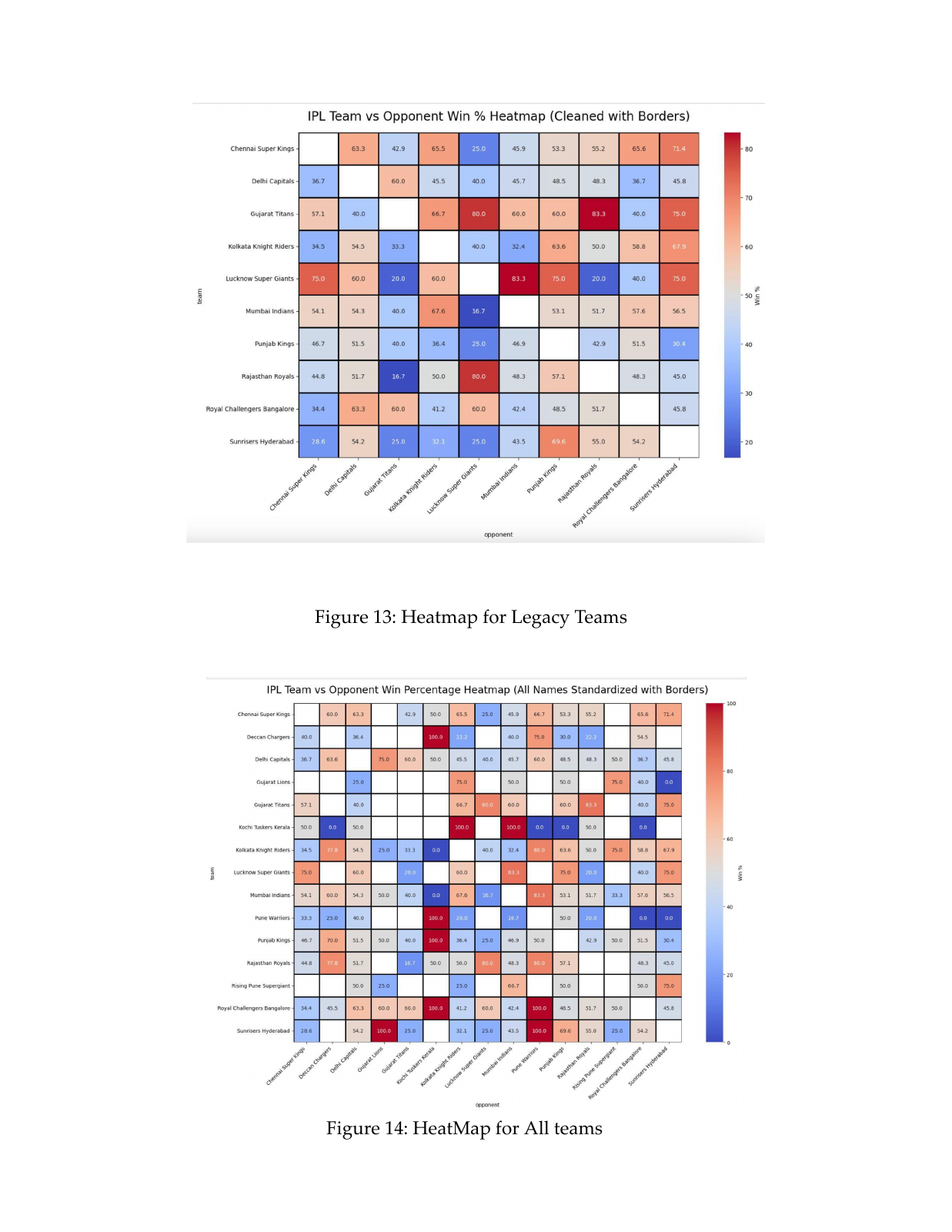
Box plots compare league and playoff scoring, while heatmaps and chord diagrams reveal head-to-head patterns.
Line and bubble charts place brand value alongside competitive results without treating correlation as causation.
The project publishes a Jupyter notebook and a detailed report. Sai Nihal’s credited contributions are data analysis, visualization, and report writing.
The project’s strongest shift is from leaderboard reporting to question-led analysis: a rivalry, a pressure situation, or a consistency pattern gives the data a narrative.